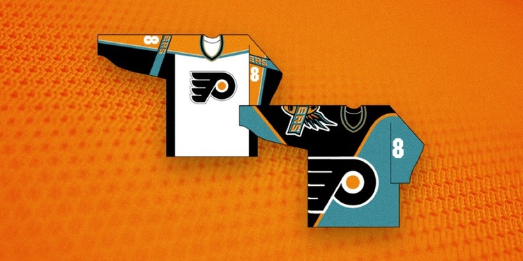
The Flyers will debut a new third jersey next season, which gave the folks over at Icethetics the perfect opportunity to discuss what could have been back in the mid-1990s: a Flyers jersey proposal that prominently featured teal.

God, that’s just so awful. Then again, it was the 1990s and everything was awful. But yikes.
This would have been worse than just about any jersey worn that decade, mostly because it’s a complete departure from the Flyers entire identity. The Ducks “Wild Wing” jersey is often cited as the worst jersey of the 90s, but at least it held the team’s same colors and mascot. This thing is just the worst. I mean, teal of all colors? How 90s is that?
Here’s what the designer — his name is Ken Loh and he designed many of the other third jerseys we saw around the NHL in the 90s, as well as the iconic New England Patriots logo — told Icethetics about the use of teal:
I don’t really remember any specifics around the use of teal, but as I noted, we were encouraged to experiment with “bold” statements so I imagine that was part of where that came from.
The best part, of course, is that the Flyers obviously said no to this design. Aside from a brief lapse in judgment in the mid-2000s, and maybe the two years of the Cooperalls, the Flyers have always been a very well-dressed hockey team.
You can see more images over at Icethetics.
image via Ken Loh and Icethetics


