![]() Two weeks ago, we teased you with a look at our brand new Broad Street Hockey logo. But in doing so, we were admittedly a bit tight-lipped about how this new logo would be implemented into our site. We let on that major changes were indeed coming, but we didn’t share exactly what those changes would be.
Two weeks ago, we teased you with a look at our brand new Broad Street Hockey logo. But in doing so, we were admittedly a bit tight-lipped about how this new logo would be implemented into our site. We let on that major changes were indeed coming, but we didn’t share exactly what those changes would be.
Until now.
At its core, the BSH experience will not change. We’ll still be offering the same superb (or perhaps superbly mediocre, depending on your opinion) type of analysis, commentary and news you’ve come to enjoy here and we’ll still be a great home to the best Flyers community on the series of tubes.
But we’re going to improve that experience ten-fold with a modern design and flexible layout that was created with the intention of highlighting our best writing and the biggest stories. The new design will also reduce clutter on our pages (lookin’ at you, side bar nightmare), allowing the site to load faster and run better.
An increasing number of our readers are engaged through mobile devices, whether it be a smart phone or a tablet, and our new responsive design also keeps those users in mind. The experience will not change regardless of your device.
Most importantly, GameThreads, FanPosts, FanShots and our state-of-the-art commenting system are staying just the same. I’ve always said that our community is the best part of our site and we’ve made sure to take steps to preserve that with our new re-launch.
Take a jump with us to grab a sneak peek of the new changes with help from a sampling of blogs from across the SB Nation network.
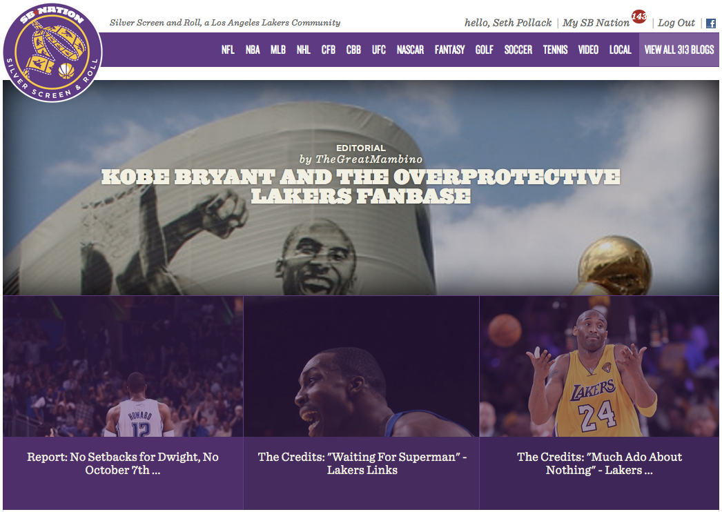
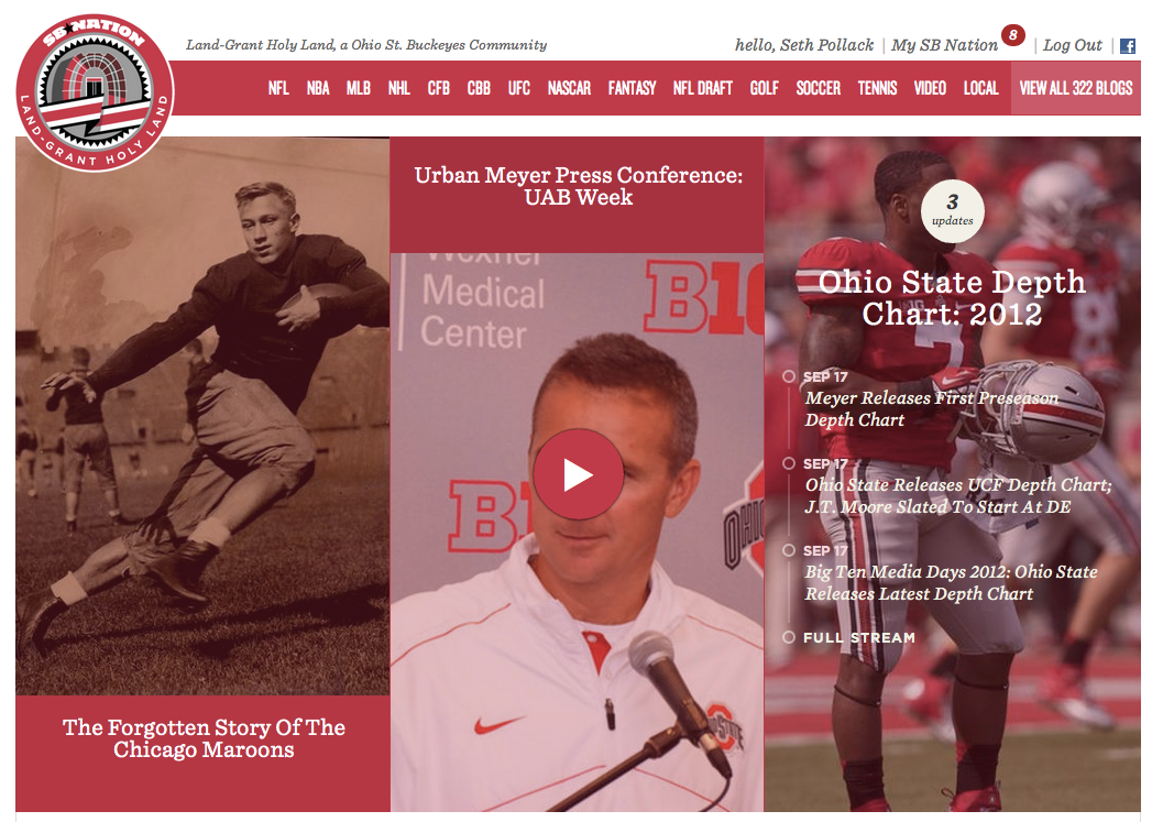
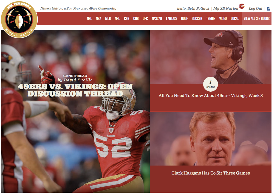
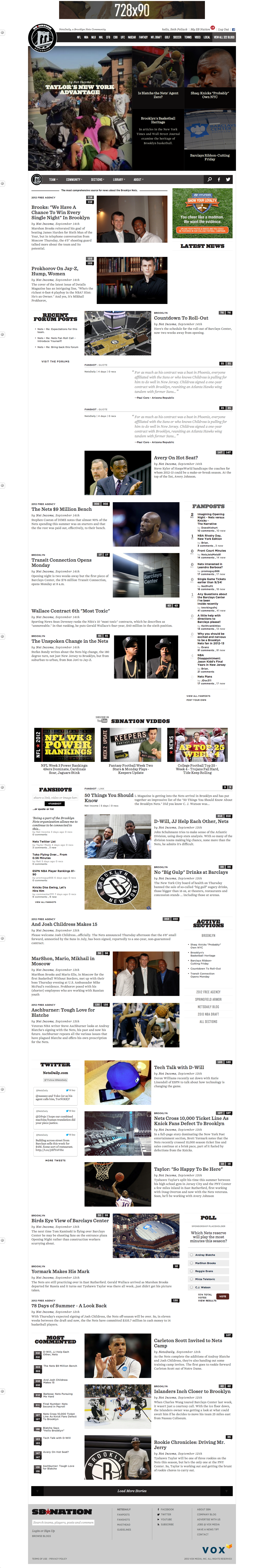
The top section of the site is what we call the “cover.” It’s fully customizable by us editors — we can insert any type of content into the cover and we have multiple layout options to choose from. Click all images below to enlarge.

The top of the front page layout will be flexible, allowing us to present content based on its value or based on the importance of a given story. In the example above, a section featuring power rankings is featured, alongside four major recent stories. The next three pictures below depict alternative layouts for the front page.
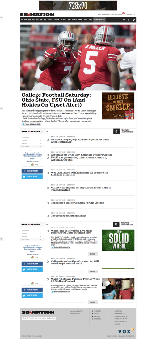
One of the new tools we’ll have are called StoryStreams. If you’re a reader over at SB Nation Philly or SBNation.com or even The Verge, you’re likely familiar with the technology. It gives us the opportunity to display a story — in the example below, a running stream on the day in college football — in an easy to read chronological time line.
This is especially valuable with stories that span over long periods of time, i.e. the story of Chris Pronger’s injury woes.
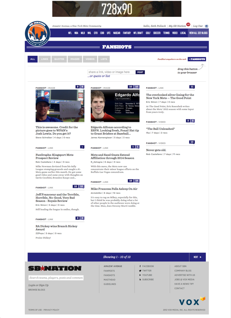
Of course, FanShots are still a major part of the design, the ideal way for you to share something you find elsewhere with the BSH community. FanPosts and FanShots will have their own sections just as they do now.
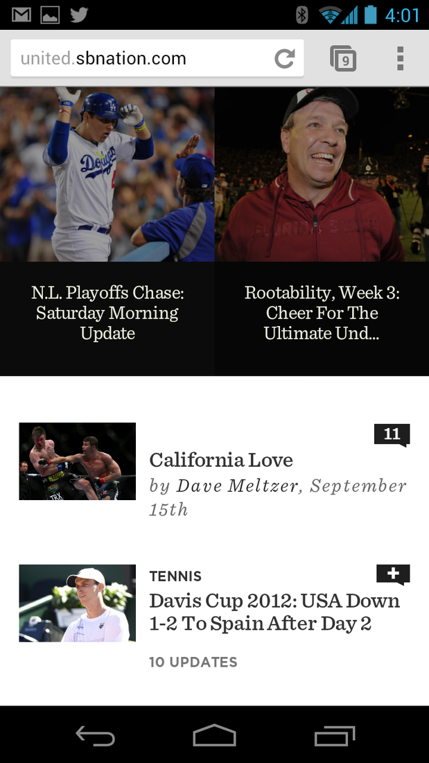
Onto mobile: The mobile view is intended to bring the same experience you’d see on a desktop or laptop computer to your mobile device. Here’s a smartphone view:
And a tablet view:

And lastly, here’s a long view of the front page of a site — underneath the “cover” you have recent stories in a “river” of content very similar to what we have today. There are cleaned up sidebars for FanPosts, FanShots, Most Commented stories and more.
We’re ridiculously excited for the new look BSH, but at the same time, we know that change on the Internet is always met with hesitation. Feel free to voice your concerns below in the comments as always. I’m happy to answer your questions as much as possible.